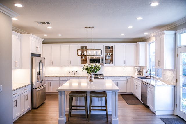
When it comes to choosing the right color scheme, it’s not just about picking your favorite hues. Color has the power to evoke emotions, create moods, and convey messages. It’s like a painter’s palette, where each color represents a unique symbol, a visual language that speaks to our deepest desires and needs.
Imagine walking into a room that instantly makes you feel at home, where the colors embrace you like a warm hug. Or stepping into a store where the vibrant hues stimulate your senses and ignite a sense of excitement. These experiences are not by chance but by deliberate design.
In this article, we will guide you on a journey of color exploration. You will learn about the principles of color theory and how to consider the purpose and mood of your space. We will delve into the art of combining colors and teach you how to test and evaluate different schemes. And finally, we will show you how to incorporate your brand identity into your color choices.

So, let’s embark on this colorful adventure together and discover the power of choosing the right color scheme.
1. Understanding Color Theory
Now that you’ve grasped the basics of color theory, it’s time to dive deeper and explore how different colors interact and create harmonious or contrasting combinations. Understanding color theory is essential when it comes to choosing the right color scheme for any project. Colors have the power to convey emotions and create a certain atmosphere, so it’s important to choose wisely.
When it comes to color schemes, there are a few key concepts to keep in mind. The first is the color wheel, which consists of primary, secondary, and tertiary colors. Primary colors are red, blue, and yellow, and they can’t be created by mixing other colors. Secondary colors are created by mixing two primary colors together, and they include purple, green, and orange. Tertiary colors are created by mixing a primary color with a neighboring secondary color.
Another important concept is color harmony. This refers to the pleasing combination of colors that work well together. There are several ways to achieve color harmony, such as using complementary colors, which are opposite each other on the color wheel, or analogous colors, which are next to each other. These combinations create a sense of balance and unity.
Contrasting colors, on the other hand, are colors that are opposite on the color wheel. These combinations create a bold and eye-catching effect. They can be used to create a focal point or to add visual interest to a design.
By understanding color theory and how different colors interact, you’ll be able to choose the right color scheme that creates the desired atmosphere and evokes the appropriate emotions for your project. So go ahead and explore different combinations, experiment, and have fun with colors!
2. Considering the Purpose and Mood
Firstly, it’s essential to understand the intended purpose and desired atmosphere when deciding on a color palette. The colors you choose will have a significant impact on the mood and overall feel of your design. Here are three important factors to consider:
- Emphasize warmth and coziness: If you want your space to evoke a sense of comfort and relaxation, opt for warm colors like earthy tones, such as terracotta or mustard yellow. These colors can create a welcoming and inviting atmosphere, perfect for a cozy living room or a bedroom retreat.
- Spark creativity and energy: To inspire creativity and boost energy levels, consider using vibrant and bold colors like red or orange. These colors are known to stimulate the mind and can be perfect for a home office or a creative studio. They can help create a space that encourages productivity and innovation.
- Promote a sense of serenity: If you desire a calm and peaceful environment, choose cool and soothing colors like blues and greens. These colors can help create a tranquil atmosphere, ideal for bedrooms or meditation spaces. Incorporating shades of blue can evoke a sense of tranquility and promote relaxation.
Remember, the purpose and mood you want to achieve should guide your color choices. By considering these factors, you can create a color scheme that not only reflects your style but also enhances the desired atmosphere and promotes a sense of belonging in your space.
3. Exploring Color Combinations
Unleash your creativity and let your emotions soar as you explore the endless possibilities of combining colors to create a captivating visual masterpiece. When it comes to selecting the right color scheme, it’s important to consider the impact you want to make and the emotions you want to evoke.
There are various color combinations that can help you achieve your desired effect.
One popular combination is analogous colors, which are colors that are next to each other on the color wheel. This combination creates a harmonious and soothing effect, perfect for creating a sense of calm and tranquility.
For a more vibrant and energetic look, you can opt for complementary colors. These are colors that are opposite each other on the color wheel and create a strong contrast. This combination is great for grabbing attention and creating a dynamic visual impact.
Another option is to use a monochromatic color scheme, which involves using different shades and tints of the same color. This creates a sophisticated and cohesive look, perfect for a more elegant and refined atmosphere.
Triadic colors, on the other hand, involve using three colors that are equally spaced on the color wheel. This combination creates a balanced and harmonious look, perfect for creating a sense of unity and stability.
As you explore these different color combinations, remember to trust your instincts and choose colors that resonate with your desired mood and purpose. With the right color scheme, you can create a captivating visual experience that will leave a lasting impression on your audience.
So go ahead and let your imagination run wild as you paint your world with the colors of your dreams.
4. Testing and Evaluating
Explore the potential of your color combinations by testing and evaluating different options to create a visually captivating masterpiece that will leave a lasting impression on your audience. When it comes to choosing the right color scheme, the process of testing and evaluating is crucial. It allows you to find the perfect combination that resonates with your audience and conveys the message you want to communicate.
To begin, gather a variety of color samples and experiment with different combinations. Use a color wheel or online tools to help you visualize how colors interact with each other. As you test different combinations, consider the emotions and associations that each color evokes. For example, warm colors like red and yellow can convey energy and excitement, while cool colors like blue and green can create a sense of calmness and tranquility.
To evaluate your color combinations, create a table to compare different options. In one column, list the colors you are considering, and in the adjacent column, write down the emotions or associations each color conveys. Additionally, consider how the colors complement or contrast with each other. This table will help you visualize the impact of each combination and make an informed decision.
Remember, the goal is to create a color scheme that not only looks visually appealing but also resonates with your audience. By testing and evaluating different options, you can create a color scheme that creates a sense of belonging and connection for your audience, leaving a lasting impression.
5. Incorporating Brand Identity
To truly capture the essence of your brand, you’ll want to incorporate your brand identity into your color palette. Did you know that 80% of consumers believe that color increases brand recognition? By choosing colors that align with your brand’s personality and values, you can create a sense of belonging and loyalty among your target audience.
Start by considering your brand’s core values and the emotions you want to evoke in your customers. For example, if your brand represents trust and reliability, you might consider incorporating blues and greens into your color scheme. These colors are often associated with stability and calmness. On the other hand, if your brand is all about creativity and innovation, vibrant and bold colors like reds and yellows can help convey that message.
Another important aspect to consider is your target audience. What colors resonate with them? Conducting market research and gathering feedback from your customers can provide valuable insights into their preferences. By aligning your color scheme with what your audience desires, you can create a sense of belonging and make your brand more relatable.
Remember, a well-thought-out color scheme can make a significant impact on your brand recognition and customer loyalty. By incorporating your brand identity into your color palette, you can create a visual identity that resonates with your audience and fosters a sense of belonging.
Frequently Asked Questions
How can I determine the right color scheme for a specific target audience?
To determine the right color scheme for your specific target audience, consider their preferences and values. Use colors that resonate with their emotions and cultural associations. Remember, connecting with your audience through color can create a sense of belonging and understanding.
Is it necessary to follow current design trends when choosing a color scheme?
It’s not necessary to follow current design trends when choosing a color scheme. What matters is understanding your target audience and their preferences. Create a sense of belonging by selecting colors that resonate with them.
What are some common mistakes to avoid when selecting a color scheme?
When selecting a color scheme, avoid these common mistakes: 1) Using too many colors, which can be overwhelming. 2) Ignoring color psychology and its impact on emotions. 3) Not considering the overall design and brand identity.
Are there any psychological effects associated with specific colors that I should consider?
Consider the psychological effects of colors when choosing a scheme. Blue can evoke calmness, while red energizes and yellow promotes happiness. Find the colors that resonate with you and create the desired atmosphere.
Can I use more than one color scheme throughout a project, or should I stick to just one?
You can use more than one color scheme throughout a project if it fits your desired aesthetic and message. Mixing color schemes can add visual interest and depth to your design, so feel free to experiment and find what works best for you.
Conclusion
So there you have it, dear reader. Choosing the perfect color scheme for your project is not an easy feat, but armed with the knowledge of color theory, the consideration of purpose and mood, and the exploration of various combinations, you’re well on your way to creating a captivating visual experience.
Remember, testing and evaluating your choices is crucial, and don’t forget to incorporate your brand identity for that extra touch of uniqueness.


